Using Color Theory in Arizona Landscape Design: Creating Vibrant, Drought-Tolerant Outdoor Spaces

Color theory explains how hues, value, and saturation shape what we see and feel in a landscape. In Arizona’s bright light and dry climate, those principles help us choose plants, stone, and pool finishes that stay lively without wasting water. This guide covers the essentials—basic color relationships, drought-tolerant plant pairings, luxury palette templates for poolside living, and hardscape choices that boost perceived color and comfort. You’ll get step-by-step planning tips, side-by-side plant and material comparisons, and practical rules for coordinating furniture, stone, and water. Everything is aimed at creating cohesive, high-end outdoor rooms that perform in the desert, including short examples of how Island Pools and Landscaping AZ applies these ideas on real projects.

What Are the Basics of Color Theory for Arizona Desert Landscapes?

In desert landscapes, hue, saturation, and value behave differently under intense sun. Bright light can make colors read more saturated or, at times, wash out low-contrast schemes. Good desert palettes balance vivid blooms with textured foliage and shadow-casting forms so elements remain legible. The payoff is depth, clear focal points, and less reliance on thirsty annuals—using structural color and reflective materials to hold interest. Knowing when to use complementary contrast for drama or analogous groupings for calm helps you place plants and materials with purpose. The sections that follow translate the color wheel into practical plant pairings, scheme choices, and quick tips for xeric yards.

Research shows that applying core design principles—like line, form, texture, and color—directly affects public preference for arid-climate plantings.

Arid Climate Landscape Design: Color & Visual Preference

A study using 35mm slides of arid-plant compositions asked experts to rate designs based on line, form, texture, and color. Results showed a clear link between stronger design elements and higher public preference, supporting the idea that these principles shape attractive plantings in dry climates.

Aesthetic design using arid climate plants, 1988

The color wheel is a practical tool: it points out harmonious pairings and contrasts that will register under Arizona light. For example, cool blue-greens of agaves look striking next to warm orange blooms, while a yellow–orange–red progression reads as warm massing from a distance. Saturation matters as much as hue—highly saturated flowers pop at midday, so designers often pair them with muted foliage to rest the eye. Use these interactions to build palettes that hold up from poolside seating to distant mountain views.

Different scheme types—complementary, analogous, and monochromatic—serve distinct roles in desert gardens. Complementary pairings create bold focal points, analogous groups offer gentle transitions across long borders, and monochromatic schemes highlight texture and form when sculptural succulents dominate. In Arizona we typically use complementary palettes for entrybeds or focal islands, analogous schemes for linear plantings and slopes, and monochrome approaches when structure and shadow are the main show. These choices lead directly into seasonal planting strategies and hardscape coordination.

  • Core color concepts for Arizona desert landscapes:


    Hue, Saturation, Value

    : The three attributes that decide how color reads in bright sun and wind, and how strong a focal point will feel.


    Contrast vs Harmony

    : Complementary colors provide punch; analogous groupings create easy visual flow across long vistas.


    Material Reflection

    : Stone and pool finishes shift perceived plant color through reflection and undertone interaction.

Keep these takeaways handy as you move into plant choices that deliver color year-round with minimal irrigation.

How Can You Create Year-Round Color with Native and Drought-Tolerant Plants in Arizona?
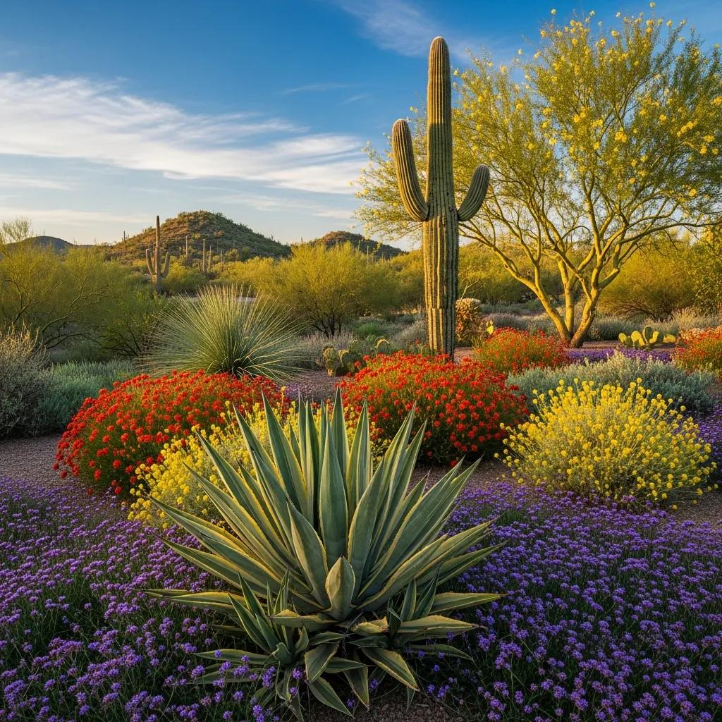
Year-round color in Arizona comes from sequencing species with staggered bloom times, mixing evergreen foliage with seasonal flowerers, and using massings for sustained visual impact. The idea is straightforward: pair structural plants (agaves, grasses, evergreen shrubs) that provide constant form with seasonal bloomers that add accents, then layer them in foreground–midground–background compositions. The result is a low-water, high-impact landscape that reads as intentionally colorful through spring, summer, fall, and mild winters. Below are plant recommendations by season and use, followed by an at-a-glance comparison of key species.

PlantBloom SeasonPredominant ColorBest Use
Desert MarigoldSpring–FallBright yellowMass planting, groundcover accent
LantanaSpring–FallOrange to pink clustersMidground accents, pollinator attractor
PenstemonSpring–SummerRed to purple spikesVertical accent, borders
Agave (blue-gray)Year-round foliageBlue-greenStructural focal point, background
Red YuccaSpring–SummerCoral-red bloomsAccent near patios or walkways
Ornamental GrassesFall–WinterGold to tan seedheadsMovement and winter interest

This quick comparison makes selection easier: mass Desert Marigold and agave for enduring foundation color, add Lantana and Penstemon for seasonal highlights, and layer ornamental grasses for texture and late-season contrast. Next we explain how to combine these plant types into coherent palettes that stay healthy on minimal irrigation.

Combining succulents, cacti, and flowering shrubs requires attention to scale, spacing, and irrigation zones so colors remain distinct across seasons. Place sculptural succulents and agaves as strong anchors in the background, use mid-sized cacti and red yucca for vertical interest in the midground, and put low-growing flowering shrubs and groundcovers in the foreground to tie colors together. Separate hydrozones to match watering needs and prepare soils that suit both shallow-rooted succulents and deeper-rooting shrubs. Thoughtful placement and mixed textures reduce reliance on annuals while providing continuous seasonal highlights, which leads into material choices that complement these plantings.

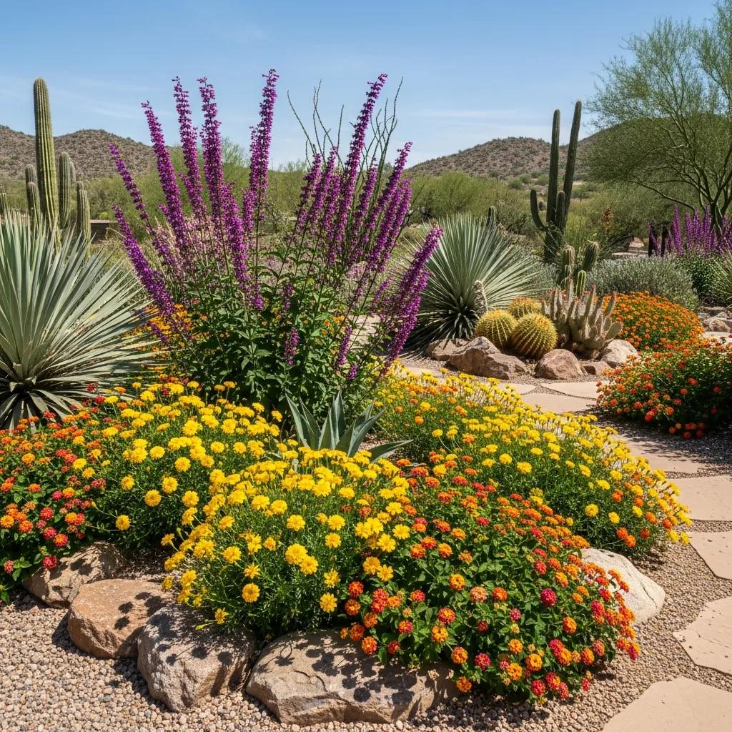
  • Seasonal planting strategy checklist:


    Layer by form and water needs: Keep structural succulents and shrubs in separate irrigation zones.


    Mass for visual continuity: Plant groups of 5–20 of the same species to create readable color blocks.


    Accent sparingly: Reserve highly saturated flowers for focal nodes near seating and entries.

Use these practical rules to shape composition and prepare the site for hardscapes that amplify plant color.

Which Arizona Native Plants Provide Seasonal Color Interest?

Several native and well-adapted species give reliable seasonal color while tolerating arid soils and strong sun. Desert Marigold delivers long stretches of bright yellow, ideal for massing. Lantana offers steady clusters of color close to patios and attracts pollinators. Penstemon provides vertical color spikes in spring and early summer that contrast with rounded succulents, while red yucca brings vibrant coral flowers that draw hummingbirds. Ornamental grasses add movement and golden backdrops into winter. Plant each species with its scale in mind—use agave and yucca as anchors, Lantana and Penstemon in mid-elevation beds, and low groundcovers to soften hard edges. This choreography keeps color lively and maintenance low.

How to Combine Succulents, Cacti, and Flowering Shrubs for Vibrant Palettes?

Good combinations balance form, texture, and bloom timing. Pair a blue-gray agave with orange Lantana and golden grasses for a warm desert palette that reads from a distance. For cool poolside groupings, combine silver-leafed succulents, teal-toned Aloe, and purple Penstemon to underscore blue-green water. For planted islands or entry features, use a sculptural agave center, surround it with red yucca and low Desert Marigold, and finish with gravel mulch in a complementary tone to sharpen contrast. Allow enough spacing for mature forms, and use blended soils that provide drainage for succulents and enough depth for shrubs. These principles lead naturally into choosing hardscape colors that harmonize or deliberately contrast with planting palettes.

What Luxury Color Palettes Enhance Arizona Pool and Outdoor Living Spaces?
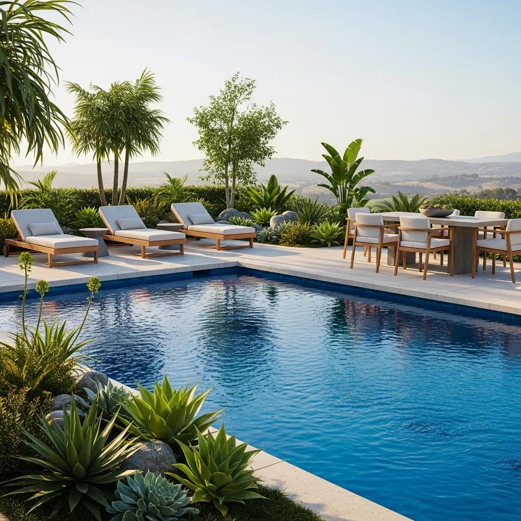
Luxury palettes link plant color to pool finish, coping, and fabrics so water, stone, and foliage read as a single composition. Pool finishes and paver undertones influence the perceived water color and adjacent plant hues; choosing them deliberately creates moods from calm spa retreats to lively entertainment yards. The result is a cohesive, high-end aesthetic that performs under desert light. Below are three palette templates with material suggestions and short project notes showing how subtle material tweaks amplify plant color.

Palette Name/ProjectPrimary ColorsAccents / MaterialsMood
Modern DesertBlue-green agave, muted sage foliageDark travertine, matte black fixturesSophisticated tranquility
Mediterranean-InspiredOlive foliage, lavender blooms, warm terracottaWeathered stone, terracotta potsWarm, convivial elegance
Contemporary CoolSilver succulents, deep blue pool finishLight gray pavers, stainless accentsCalm, refined resort feel

Use these templates as starting points and adjust scale and materials to your site. A Modern Desert palette with matte black fixtures and dark coping sharpens contrast around blue-green agaves, while Mediterranean choices—terracotta and lavender—lend a warm, welcoming tone.

At Island Pools and Landscaping AZ we translate these templates into built projects by coordinating sculptural succulents with specific coping and pool finishes to tune water color against plant hues. In one recent job, muted blue-green agaves and olive shrubs framed a dark-finish pool whose reflected depth made orange floral accents read richer at dusk. A short consultation with our design team helps adapt a template to your light, preferences, and maintenance goals.

  • Palette decision checklist for poolside design:


    Match pool finish to mood: Light finishes brighten and create turquoise water; dark finishes deepen reflection and add contrast.


    Coordinate coping and pavers: Pick undertones that either harmonize with or deliberately contrast foliage.


    Tie textiles to plant accents: Use cushion colors that echo seasonal blooms for visual cohesion.

These rules help you choose a luxury palette that feels intentional and stands up to Arizona’s climate.

How Do Modern Desert and Mediterranean-Inspired Palettes Differ?

Modern Desert palettes focus on muted foliage, sculptural succulents, and warm neutrals—often paired with dark travertine or textured concrete to ground clean lines. The look is refined and minimal, where form and shadow become the main attractions. Mediterranean-inspired palettes favor brighter flowering shrubs, olive tones, and terracotta, with weathered stone and ceramics creating a layered, lived-in warmth. You can move between these styles by changing plant density and a few material choices—swap dark coping for warm stone and add flowering shrubs to soften a Modern Desert scheme into Mediterranean territory. Recognizing this spectrum helps homeowners choose a direction and keep design consistent across plants and finishes.

How to Integrate Poolside Colors with Landscape Design?

Start by understanding how the pool finish reflects sky and plants, then select adjacent materials and plantings to complement that reflection. Light pool finishes reflect turquoise and aquas and pair well with silver foliage and cool succulents; dark finishes deepen blues and benefit from warm plant accents and lighter coping to maintain contrast. Frame pools with low massings so water views remain open and use vertical accents near seating to draw the eye without competing with the pool. Choose fade-resistant fabrics and accessories that echo plant accent hues for continuity. These coordination steps keep the pool the focal point while allowing plants and materials to reinforce the intended mood.

How Do Hardscape Colors Complement Softscape Elements in Arizona Landscapes?

Hardscape color affects how plant colors read through undertones and reflected light. When choosing stone, pavers, and water finishes, balance heat absorption, texture, and color temperature to support your plant palette. Warm earth-toned pavers enhance golden and warm-flowering plants; cool grays make blue-green succulents pop by contrast. The right hardscape choices reduce visual conflict and strengthen the desired mood—whether a peaceful oasis or an energetic entertainment area. The material comparison below helps you weigh color and functional trade-offs.

Recent work also highlights hardscape’s role in outdoor thermal comfort: surface materials and layout significantly affect heat absorption and reflected radiation in arid settings.

Hardscape Design for Thermal Comfort in Arid Climates

Research examining design layouts and surface materials shows how choices influence reflected solar energy and mean radiant temperature (MRT). Using Cairo as a case study, the work explores parametric and generative design methods to optimize microclimates—offering guidance for sustainable, climate-conscious outdoor spaces.

The effective landscape design parameters with high reflective hardscapes: guidelines for optimizing human thermal comfort in outdoor spaces by design-a case on …, RA Abdelwahab, 2025

MaterialColor / UndertoneHeat AbsorptionDesign Role
TravertineWarm beige with subtle veinsLow to moderatePool coping, terraced steps
Concrete PaversCool gray to warm taupeModerate to highPatios, seating platforms
Terracotta TileRich orange-redModerateAccent walls, planters
Dark SlateDeep charcoalHighModern edging, focal features

This table highlights trade-offs: travertine keeps surfaces cooler and suits warm palettes, while dark slate creates drama but raises surface heat. Choosing materials with complementary undertones preserves plant color legibility and helps with comfort.

For furniture and accessories, neutral fabrics work well as a durable base; add accent pillows and rugs that pick up seasonal plant colors to tie everything together. Metal finishes—bronze, matte black, or brushed steel—shift perceived warmth around plantings, so test finishes with planted samples when possible. Use UV-stable, colorfast textiles to keep colors true over time, and place seating to create shade that reveals richer tones in the evening. Thoughtful placement also frames important views and improves plant texture and color legibility throughout the day.

  • Hardscape selection rules:


    Match undertones to plant hues: warm stones with warm flowers, cool grays with blue-green foliage.


    Consider heat management: lighter surfaces reduce radiant heat in active zones.


    Use finishes to complement metalwork and fabrics: coordinate small accents to tie the composition together.

These practical rules reconnect material choices to plant color strategy and poolside comfort.

What Stone, Paver, and Water Feature Colors Work Best in Desert Settings?

Warm earth tones like buff travertine and warm taupes blend with native soils and enhance golden or orange accents; cool gray pavers contrast beautifully with blue-green succulents and silver foliage. Dark finishes—charcoal slate or deep concrete—raise contrast but also absorb more heat, so use them in shaded or low-traffic accent areas. For water features, light pool finishes produce bright turquoise reflections that suit cool palettes, while darker finishes yield deeper blues that make warm flowers pop. When choosing materials, balance color with texture and slip resistance—surface finish affects both safety and how color reads under sun and shadow.

How to Coordinate Outdoor Furniture and Accessories with Plant Colors?

Start with neutral upholstery for longevity, then introduce accent textiles that echo plant tones to unify the scene. Neutral linen sofas with rust or saffron pillows pick up orange Lantana blooms; muted teal cushions harmonize with blue agave. Test metal finishes—bronze, black, brushed steel—against planted samples to see how they shift perceived warmth. Choose UV-stable fabrics and fade-resistant finishes, and place textiles where evening shade reveals deeper tones. These steps keep accessories supportive, not competitive, with the planted palette.

How Do Warm and Cool Colors Evoke Moods in Your Arizona Outdoor Oasis?

Warm and cool colors trigger predictable emotional responses you can use to shape space: reds and oranges energize and draw attention; blues and greens calm and encourage lingering. Visually, warm hues advance and add perceived activity, while cool hues recede and soothe. This lets you create distinct zones—an energetic entertainment deck and a tranquil poolside retreat—by controlling dominant color temperature and using neutrals for balance. Below we outline emotional impacts for warm and cool palettes and how to apply them.

  • Mood-driven palette samples:


    Energizing Entertainment

    : Terracotta accents, red yucca blooms, warm pavers to encourage social energy.


    Tranquil Retreat

    : Silver succulents, blue pool finish, light-gray pavers to calm and center the space.


    Balanced Transitional

    : Olive shrubs with muted floral accents to create comfortable, multi-use zones.

These sample palettes show how color temperature maps to function and guide follow-up design choices, including on-site implementation steps.

What Emotional Effects Do Warm Colors Like Reds and Oranges Create?

Reds and oranges boost energy, focus attention on focal elements, and create a warm, welcoming feel—perfect near seating and dining areas. In desert sunlight, warm hues intensify, so use them as controlled accents—cushions, pots, or small massings—so they provide impact without visual fatigue. Pair warm accents with cool backgrounds to keep the energy readable and comfortable. That balance helps place warm colors where they best serve social or visual goals.

How Do Cool Colors Like Blues and Greens Promote Tranquility?

Cool colors reduce visual stimulation and encourage relaxation, making them ideal for pool surrounds and quiet nooks. Blue and green plantings paired with reflective water finishes create a cohesive field that supports restful moods and a perception of lower temperature. Use texture and sculptural forms—silver-leaf succulents, grasses, and agaves—to keep interest without breaking the calm. Small contrast accents and thoughtful lighting guide the eye at dusk while maintaining a tranquil atmosphere.

How Does Island Pools and Landscaping AZ Apply Color Theory in Their Design Process?

At Island Pools and Landscaping AZ we apply color theory through a clear, site-driven process that starts with a walkthrough and ends with a coordinated installation and handoff. Our focus is site-specific analysis—sun exposure, soil, existing plantings, and how you want to use the space—so palettes aren’t generic but tailored. The outcome is luxury outdoor rooms where plant choices, pool finishes, and hardscapes are selected to perform visually and functionally in Arizona. Below is our step-by-step process for crafting and implementing palettes.

  1. Discovery Walkthrough and Goal Setting
    : We walk the site with you to learn goals, priority views, and the mood you want—this sets palette direction and constraints.
  2. Site Analysis and Light Mapping
    : Designers map sun patterns, microclimates, and soil to predict how colors will read through the day and where plants will thrive.
  3. Palette Development and Material Selection
    : Using color principles, we propose plant lists, pool finishes, paver undertones, and accessory palettes for your review so every element works together.
  4. Samples, Mockups, and Client Approval
    : Physical samples and mockups let you see interactions between water, stone, and planting in real light before installation.
  5. Installation Oversight and Handoff
    : We coordinate plant placement, irrigation zones, and quality checks during construction and provide maintenance guidance and warranty info at handoff.

What Steps Are Involved in Crafting Custom Color Palettes for Clients?

Building a custom palette starts with discovery and finishes with installation oversight. We map light and sightlines to set color temperature and contrast needs, then select materials and plant species whose undertones and seasonal behavior align with the intended mood. On-site mockups and sample pockets let clients view colors in real conditions and refine choices based on maintenance and irrigation preferences. Final steps include coordinating installation timing, staking plants for composition, and confirming that pool finishes and paver samples work with the planted palette. This systematic approach keeps the realized space true to the design intent.

Can You See Examples of Successful Color Integration in Luxury Projects?

We document project snapshots that show palette logic, material trade-offs, and final visual impact in completed luxury installations. Case notes typically include the client goal (for example, a tranquil pool retreat), the color challenge (midday sun washing out delicate blooms), the design solution (higher-contrast foliage and a mid-tone pool finish), and the outcome (an outdoor room that reads well from multiple vantage points). Photo galleries of finished projects demonstrate how coordinated plant selection, coping, and textiles create cohesive, water-wise results. For homeowners who want similar outcomes, a consultation adapts those examples to your site and lifestyle.

  • How to request design input (summary):


    Prepare site notes

    : Note priority views, existing plants, and preferred materials.


    Discuss usage

    : Clarify entertainment, relaxation, and maintenance expectations.


    Schedule a walkthrough

    : Use our discovery process to get tailored palette recommendations.

These steps start a collaborative process that applies color theory practically while respecting Arizona’s climate constraints.

Frequently Asked Questions

What are the benefits of using native plants in Arizona landscape design?

Native plants cut water use, lower maintenance, and boost local biodiversity. They’re adapted to region-specific soils and climate, so they tolerate drought and local pests better than many exotics. Natives also support pollinators and other wildlife. By choosing them, homeowners create sustainable landscapes that thrive with less irrigation and contribute to the area’s ecological health.

How can color theory influence the perception of space in outdoor areas?

Color affects how we perceive scale and mood. Light colors can make areas feel larger and more open; darker tones create intimacy. Contrasting colors draw attention to features like a pool or planting bed, while harmonious palettes smooth transitions across views. Thoughtful color use lets designers shape atmosphere and guide sightlines in outdoor spaces.

What role does texture play in Arizona landscape design?

Texture adds depth and interest, especially where color is restrained. Smooth succulents versus rough stone or feathery grasses create contrast that holds the eye. Texture also changes how light reflects off surfaces, affecting perceived color. Mixing textures creates layered, engaging landscapes that stay appealing across seasons.

How can homeowners maintain color vibrancy in their desert landscapes?

Keep colors lively by matching irrigation to plant needs, choosing drought-tolerant species, and using mulch to retain soil moisture. Regular pruning and deadheading encourage blooms. Select hardscape tones that complement plants, and use UV-stable fabrics to maintain accessory color. These simple practices help landscapes look vibrant with less water and effort.

What are some common mistakes to avoid when designing with color in desert landscapes?

Avoid overloading a yard with overly bright colors that clash in strong sun, neglecting texture, and ignoring seasonal shifts in plant color. Overcrowding plants creates competition and dulls vibrancy. Make sure color choices align with your design direction and intended mood—consistency prevents visual chaos.

How does seasonal change affect color planning in Arizona landscapes?

Seasonal changes matter: different species bloom at different times. To keep color year-round, combine evergreens with seasonal bloomers so there’s always interest. Understanding bloom cycles and seasonal color shifts helps you layer plants strategically so the landscape remains engaging across the year.

Conclusion

Using color theory in Arizona landscapes improves aesthetics and supports sustainability when paired with drought-tolerant plants and mindful material choices. By thinking about hue, saturation, and undertones, homeowners can create vibrant outdoor rooms that perform in desert light while minimizing water use. If you want help translating these ideas to your property, schedule a consultation with our team—we’ll tailor a palette that fits your site and lifestyle.